Behind the Design Modern Mountain Home
Jan 07, 2021 | Carpet One Floor & Home
From the cover of the winter 2021 issue of Beautiful Design Made Simple magazine, take a look behind the design with the talented Christa Pirl as she shares all the must-know details of this beautiful modern mountain home.
Set against the dramatic backdrop of the Wasatch Mountains, this 1955 ranch-style home in Salt Lake City’s charming Sugarhouse neighborhood was in need of an extensive and mindful renovation. After occupying the home for nearly ten years, the clients requested a sensitive renewal of the space that respected the original style of the home. The house had already been altered dramatically by a previous owner, and few original design elements remained. Instead, more traditional elements were added during the 1980s, as is the case in so many homes of the era. This meant the mid-century style of the original home could be referenced without current conditions dictating the new design choices and selections.
Livability and practicality were also of high importance to the clients. The creation of a calming everyday oasis away from the demands of work and busy city life was just as imperative as that of a dynamic and fun entertainment space. Additionally, the four-legged family members had to be taken into serious consideration! The selection of furnishings and fabrics was heavily dictated by these parameters, with both comfort and durability critical.
The clients also felt very strongly that the design should align closely with the stunning natural Utah environment. The color palette is drawn directly from the surrounding area: the rich rusty soil, silvery aspens, and bright mountain wildflowers. Texture functions as a prominent design tool, infusing the space with a strong tactile quality.
Variegated, ambling lines are used thoughtfully and regularly, referencing both mid-century style and natural elements such as tree branches, rivers, and mountain peaks.
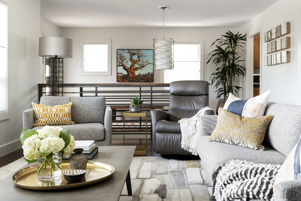
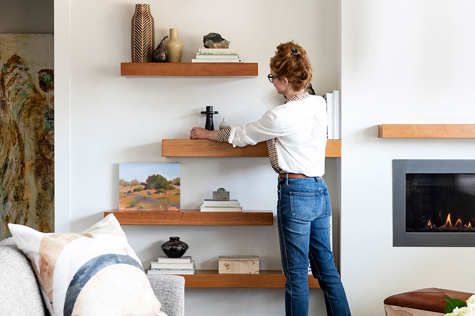
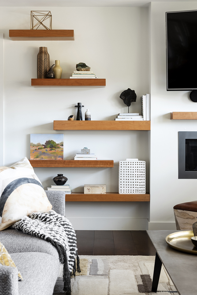
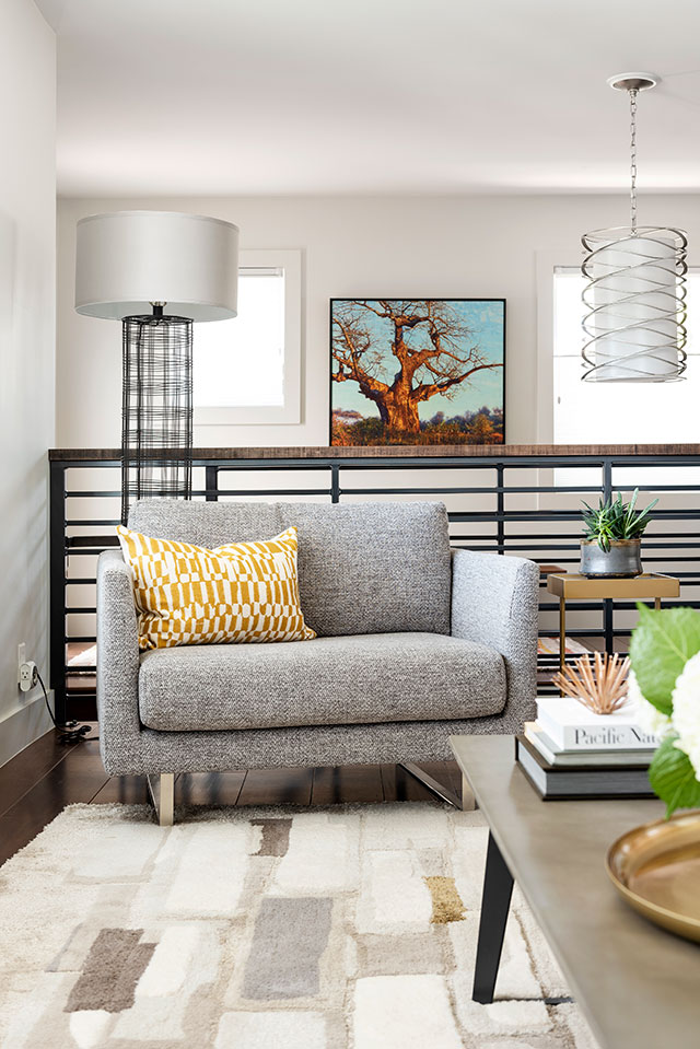
All details of the home were scrutinized and carefully addressed in a thoroughly planned design process. Before any thoughts turned toward furnishings or colorways, an extensive remodeling re-established the modern bones of the house. The neocolonial style baseboards and wood trim added by the previous owner were removed and replaced with a modern, flat profile. The traditional fireplace mantle and tile surround were removed entirely, and a new gas unit was installed with a clean drywall surround and a minimal floating wood mantle. A clunky half-wall surrounding the stairs to the lower level was removed. A new linear black metal railing was built instead, warmed by a wood handrail. A chrome and white glass pendant lights the way down the stairs and creates a vertical mass behind the living area, adding height and textural interest. Bright chrome fixtures were selected to replace aging plumbing fittings and door handles throughout. Damaged and worn honey oak floors were replaced with rich, dark cherry and textured taupe carpet. A subtle off-white wall color was selected to bring a warm glow to the walls and act as an ideal backdrop for artwork. Dated decorative lighting was replaced with fixtures in line with the clean feel of the home. None of the fixtures take center stage; instead, they subtly reference and repeat patterns and lines seen in several other areas of the new design.
Thoughtfully Curated Living Room:
A contemporary fireplace flanked by dynamic, custom floating shelves is the focal point of the relaxed yet tailored living room. The area rug references the project’s full color palette in a playful mid-century Eames-inspired pattern. The sofa’s textural, pale silver upholstery is accented by wheat- and earth-hued pillows and connects visually to the dining area. The polished concrete coffee table acts as a grounding surface for a bright pop of burnished brass and regularly rotating floral arrangements. Artwork plays a central role in this space, adding layers of both color and pattern, while also relating to the organic linear motifs that resurface throughout the home in a wide variety of surfaces and scales.
A high/low mix was purposefully created with furnishings and decorative accents throughout the home. Key pieces such as the sofa, coffee table, and dining table are high-quality custom items, purchased for comfort and durability for the long term. Barstools, accent tables, and lamps were sourced from more accessible brands, allowing for future updating in small doses. The artwork and decorative items throughout the home are a great mix as well. The clients travel extensively and shop for unique reminders of their adventures wherever they go. These personal items are displayed prominently throughout the house, with more mundane items such as vases and pillows from the likes of Crate & Barrel and Room & Board playing supporting roles. This mix creates a polished look without feeling cookie-cutter or trendy.
Modern, Mountain Kitchen:
Natural cherry custom cabinets were chosen for their timeless appeal, dramatic grain pattern, and rich, warm color. The flat panel style with minimal hardware is both up-to-date as well as appropriate to the age of the home. Paired with the soft sage green backsplash tile and grounding grey quartz countertops, the space is classic modernism at its best. The glass pendants over the peninsula seating inspired by plant stalks were designed by Hammerton Studio, a Utah-based lighting company.
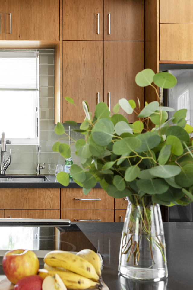
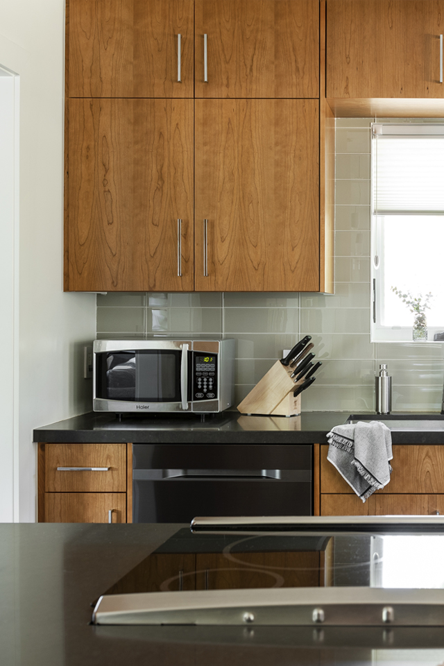
Practicality is also at the forefront of this small but efficient workspace. Full height cabinets add valuable storage while also creating the illusion of more ceiling height. The depth of the peninsula was maximized to allow for storage on all three sides, and shallow cabinets were added above the countertop, perfect for quick access to glassware and coffee mugs without taking up too much counter space. The peninsula height was kept to 36 inches instead of being raised to bar height maintain an open feel into the dining area. The counter stools also contribute to the spaciousness with delicate metal bases and no backs.
Inviting Dining Room:
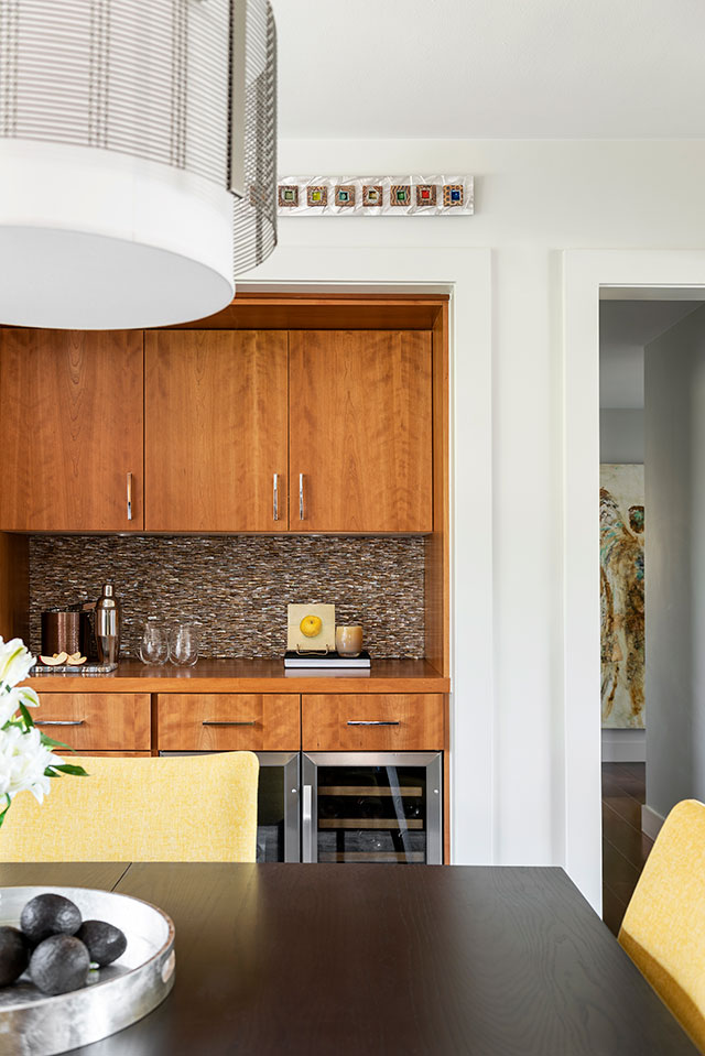
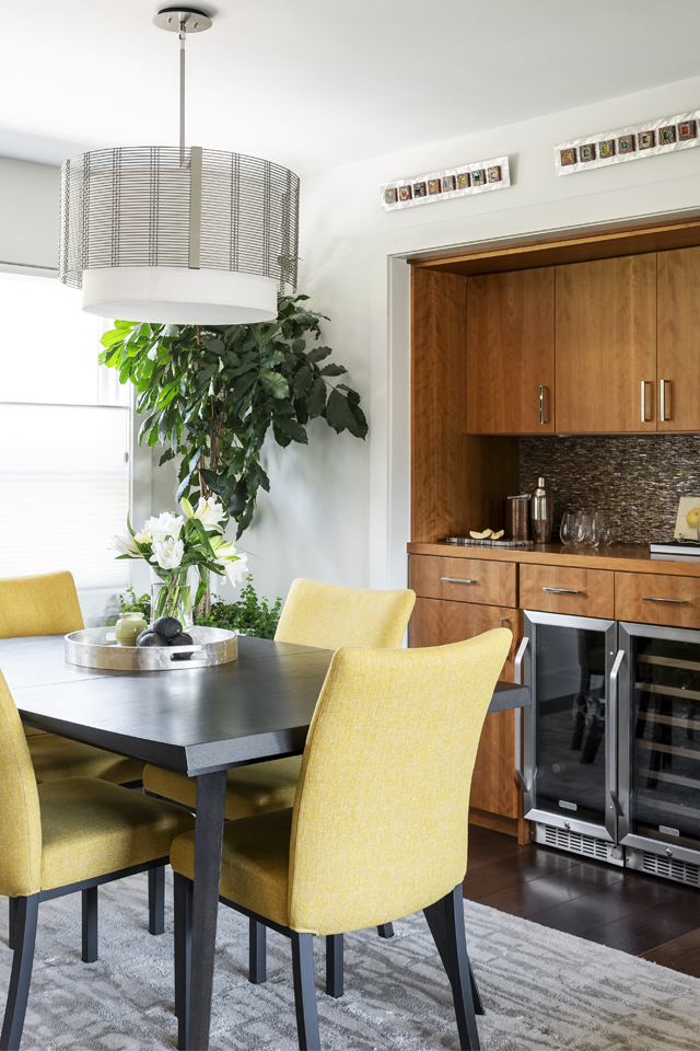 Set directly between the living, kitchen, and outdoor spaces, the centrally located dining room acts as the visual and social hub of the open living area. It draws attention despite its petite size with a splash of bold, saturated color. The rich mustard of the soft modern dining chairs recalls the wildflowers that blanket the nearby mountain valleys each spring. The dark stained table expands for special occasions, and the dramatically large-scale pendant, also by Hammerton Studio, acts as an anchor from above. The soft grey rug connects to the living room sofa and adds a subtle layer of softness without drawing attention from the colorful seating. The bar area not only provides valuable additional storage space and a beverage fridge, but also creates the opportunity for another vertical surface rich in texture. The wall behind the bar is covered in an unusual, dimensional, and iridescent shell-like tile.

 Sunny Powder Bath:
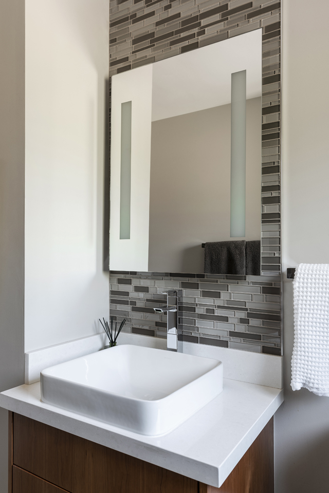
It was imperative to create a bright, open feel in this small yet important space. The crisp, pale wall color and white countertop achieves an airy feel, while the drama of the vertical backsplash tile creates the feel of a high ceiling. Chrome fixtures reflect natural sunlight, and the lit mirror saves valuable wall space by eliminating the need for sconce lights.
Warm, Welcoming Guest Bedroom:
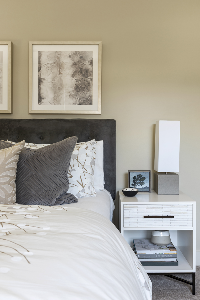
A light and soothing colorway washes this space, designed to function as a luxurious oasis for visiting family and friends. The king bed is accented with textiles and artwork that represent florals abstracted in a variety of artistic expressions. The walls gain slightly more warm color in this room, balancing the cool grey accents of the upholstered tufted headboard and bedding. The straight lines of the nightstands and concrete lamps give a modern edge to the overall softness and femininity of the space.
Cozy, Calming Master Bedroom:
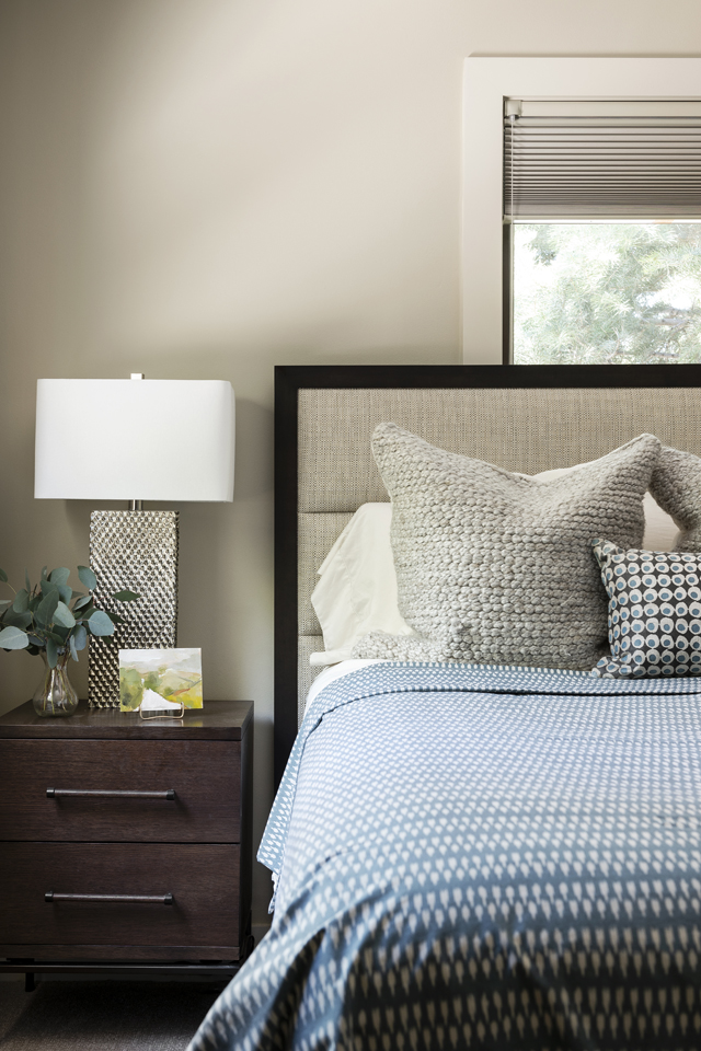
The palette of the master bedroom is noticeably a step darker and richer than other areas of the home, creating a cozy, calming environment for the homeowners. Deep blue and mahogany tones evoke a cool mountain evening approaching, while the metallic bedside lamps and decorative wool pillows exhibit texture akin to pinecones and tree bark. Textile patterns are small-scale, rounded, and organic, eliciting the feel of newly formed dewdrops on a forest floor.
Mountain-Inspired Master Bath:
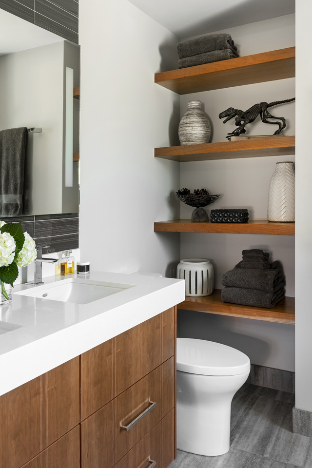
An unused nook in the master bath was transformed into useful and attractive floating shelves for both display and extra storage. The decorative objects add personality and contrast to the clean lines of the space. Both the charcoal-streaked porcelain floor tile and the blue-grey glass backsplash tile have the appearance of solid mountain rock. The cramped bathtub was removed and replaced with a large frameless glass shower enclosure that allows natural light to reach the vanity area. An extra-thick countertop gives added visual weight to the floating dual-sink vanity.
While this house is certainly not a strict mid-century restoration, the lines and massing of space give the sense of being in a 1950s interior. There is history here. The finishes, textures, and colors are refreshed and new yet also feel out of time, not trendy or overly contemporary. The home is grounded in this particular locale, even without direct reference to the mountains or the state of Utah. There is a pervasive warmth and comfort that suits the relaxed lifestyle of the clients and their guests. This warmth flows easily and seamlessly from one space to the next, creating a cocooning retreat away from the busyness of the outside world while always looking upwards towards the natural beauty just on the horizon.
Interior Design: CHRISTA PIRL | Photography: LUCY CALL